Important Links
Overview
Payeep is a digital payment platform that allows users to complete transactions using multiple channels, including Card, Bank Transfer, USSD, and QR Code. My task was to design the entire checkout experience from scratch, ensuring it was accessible, clear, and consistent across all methods.
My Role
UI/UX Designer Responsible for user flow planning, interface layout, visual design, and usability optimization.
Design Process & Flow
User Flow Planning
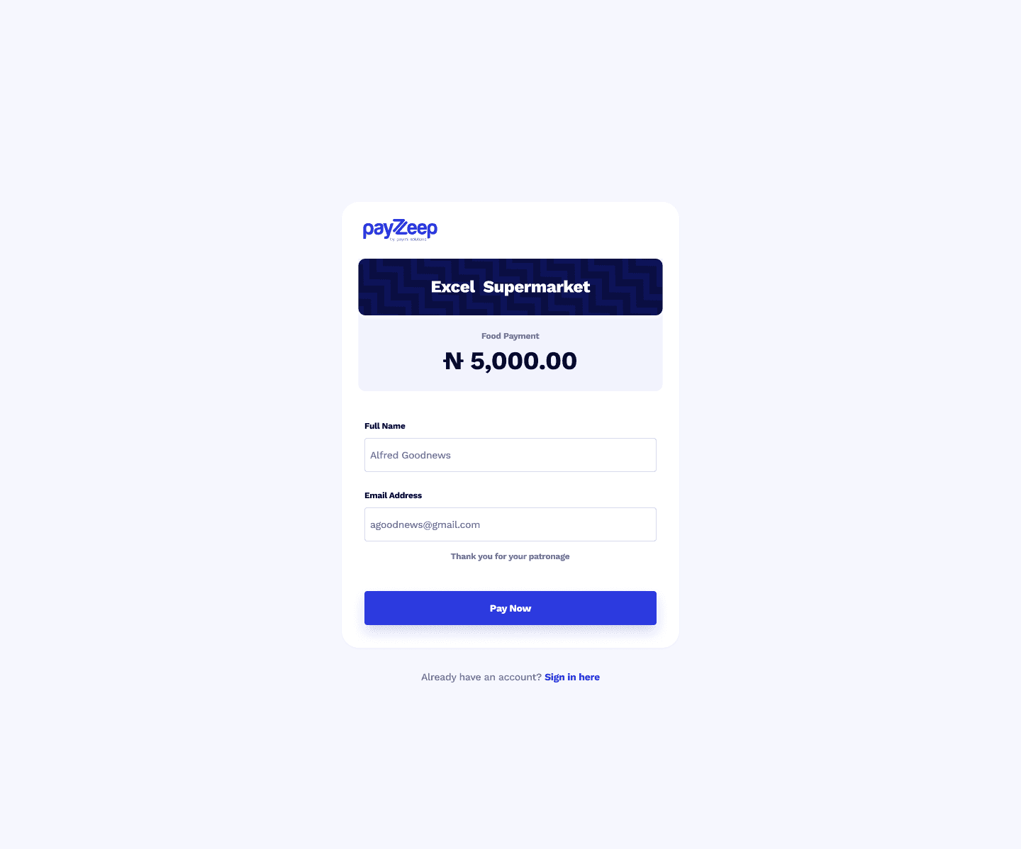
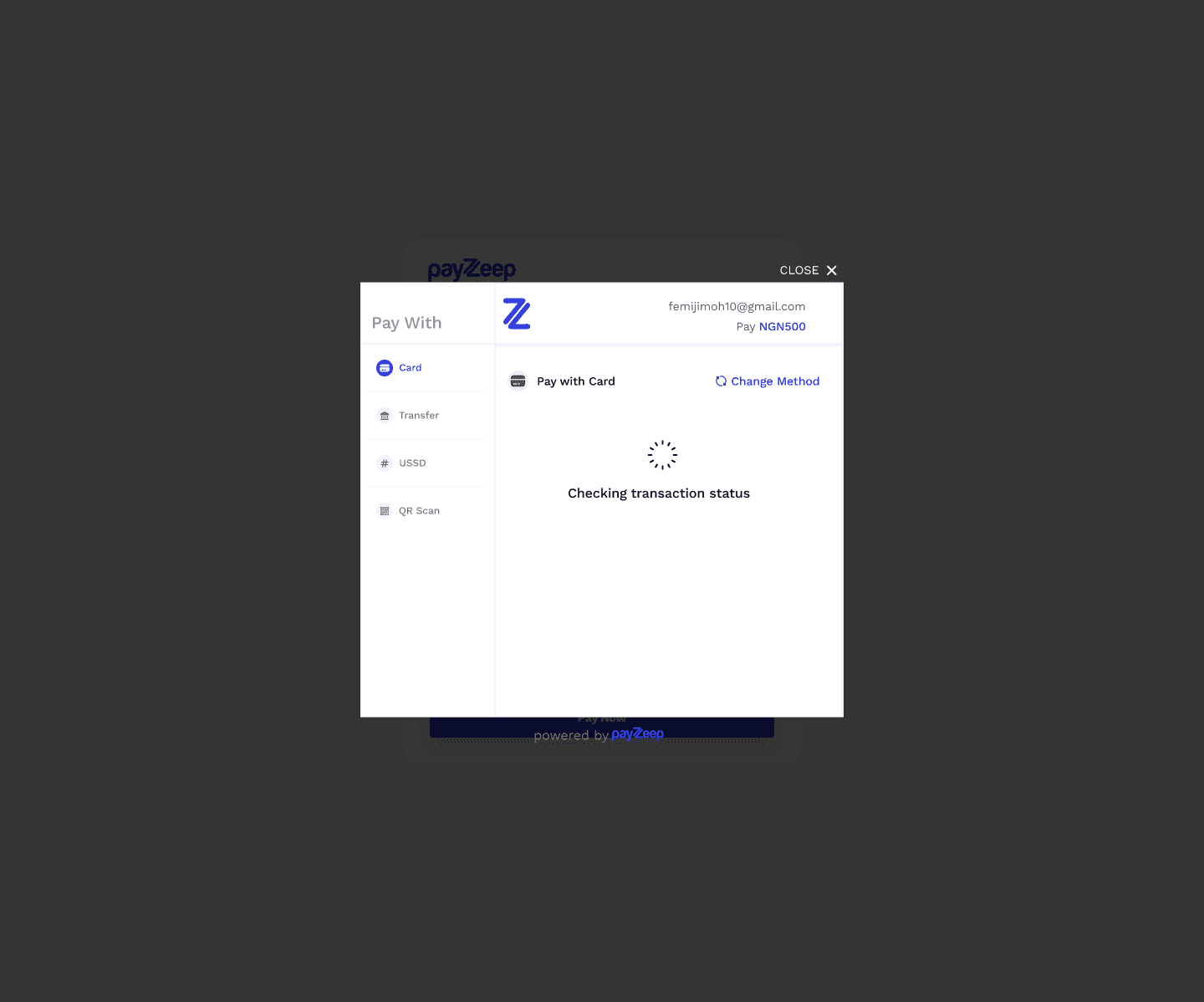
Before diving into visuals, I mapped out the entire user journey, from clicking "Pay" to confirming a successful transaction. I ensured that the transition between payment methods was seamless, with minimal friction.
Key Steps in Flow:
User selects payment method.
Enters required details (or follows instructions).
Confirms or submits payment.
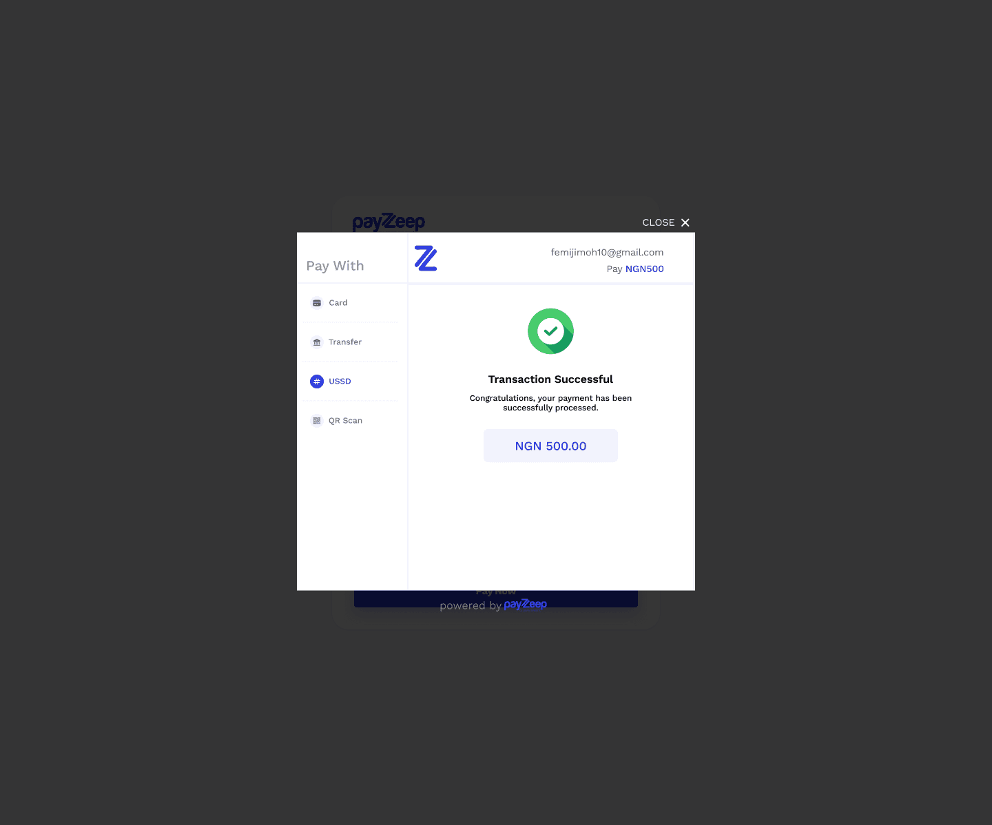
Receives feedback (success, error, or action required).
Modular Checkout Structure
I designed the checkout as a modular interface with a sidebar menu for switching between payment methods. This made the experience more intuitive and allowed users to change options without losing progress.
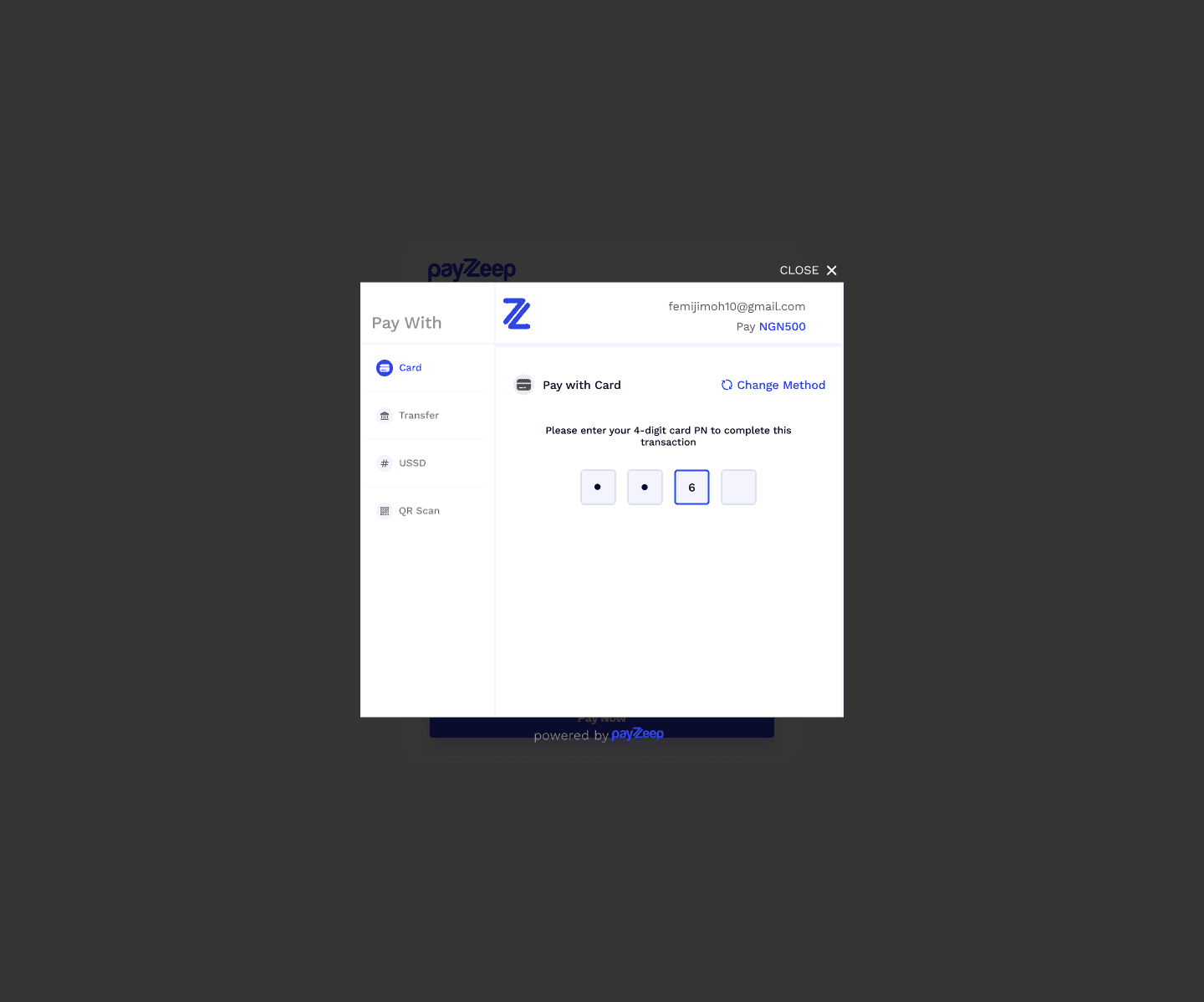
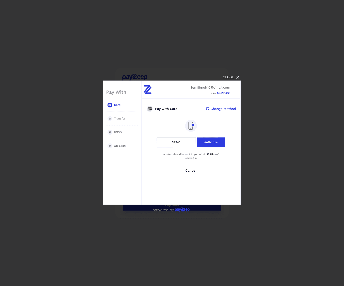
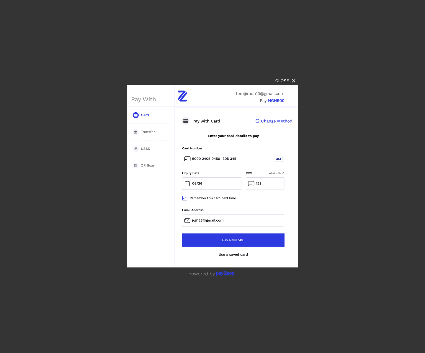
Pay with Card
Standard input fields: Card number, Expiry, CVV.
Clean layout with immediate validation feedback.
Secure visual elements (icons, padlock) to build trust.
Research & Insights
Before starting the design, I studied existing checkout flows from leading payment platforms — Paystack, Flutterwave, Moniepoint, and Interswitch — to understand best practices, friction points, and user expectations. This helped me identify design patterns that work, avoid common pitfalls, and ensure my approach was rooted in real-world usage.
Key Observations:
Paystack focused heavily on clarity and simplicity, especially in their transfer and card flows.
Flutterwave offered a strong brand identity with helpful tooltips but sometimes overloaded the interface with elements.
Moniepoint had a more enterprise feel, prioritizing speed and minimalism.
Interswitch had multiple steps, which risked user fatigue, especially on mobile.
What I Learned:
Consistency across payment options is crucial; switching methods shouldn’t confuse the user.
Microcopy (like “I’ve transferred the money”) makes or breaks user confidence.
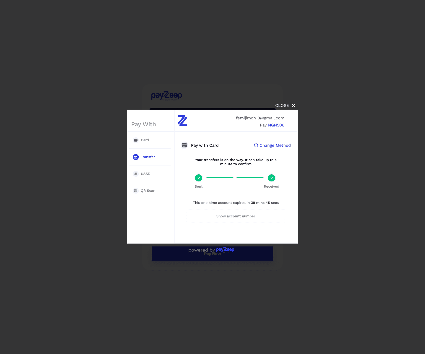
A countdown timer on transfer screens builds urgency and trust when using virtual accounts.
QR and USSD need to be extremely clear — users often have no margin for guesswork on those flows.

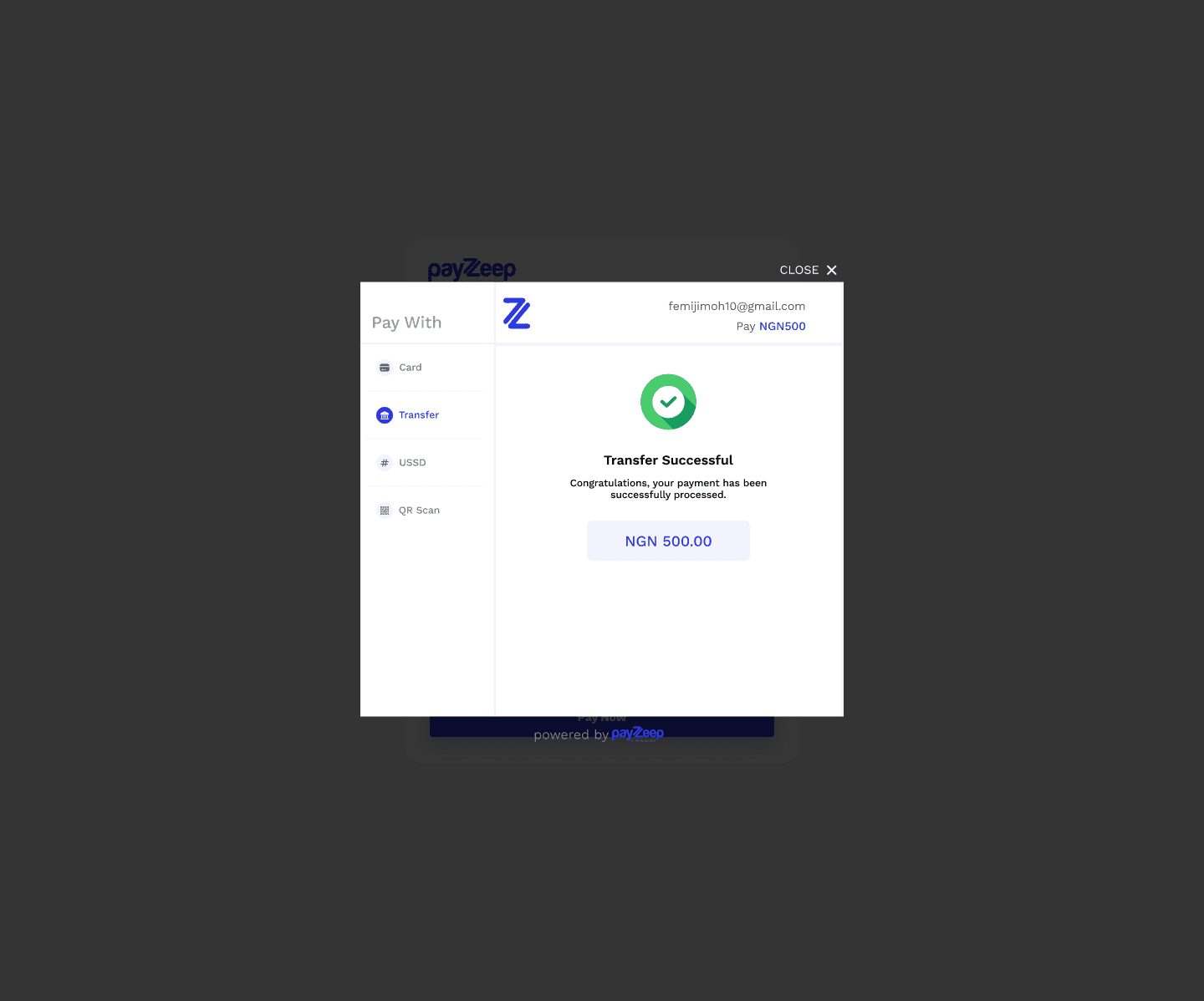
Pay with Bank Transfer
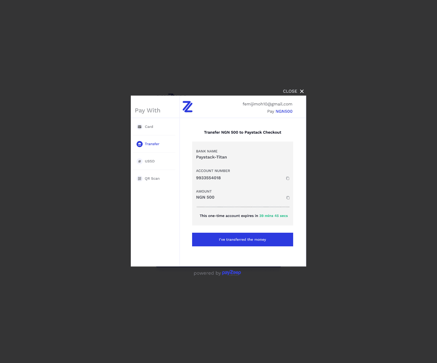
One-time account details displayed (bank name, account number, amount).
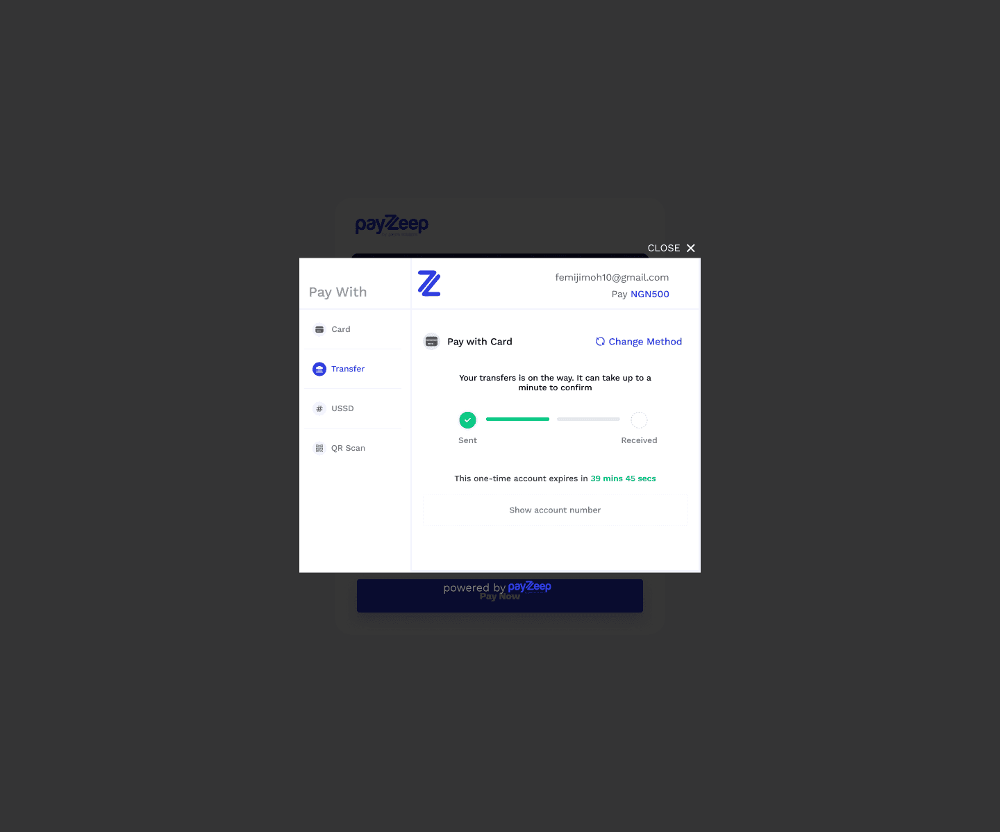
Countdown timer to reinforce urgency and expiration.
“I’ve transferred the money” button for manual confirmation.
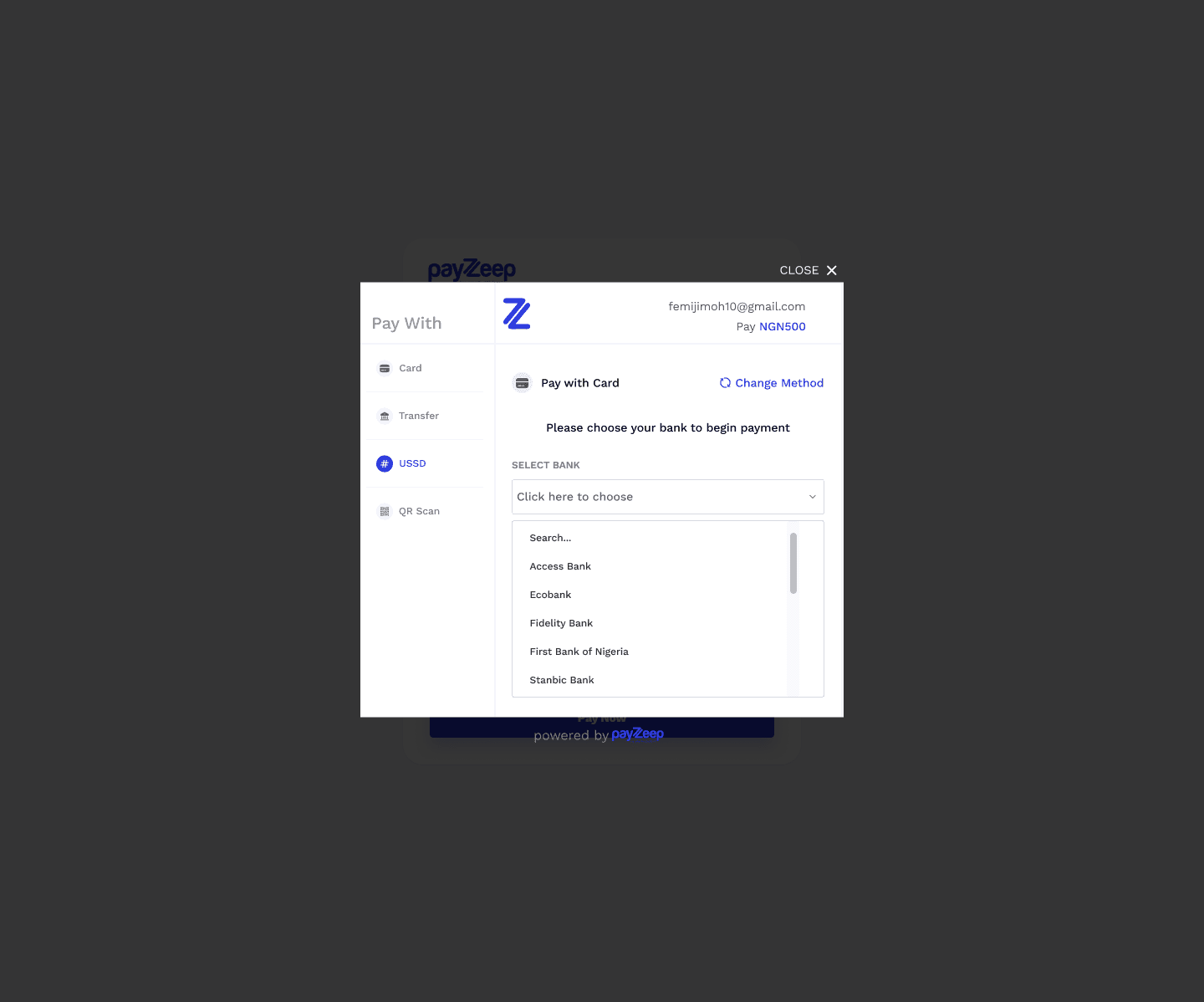
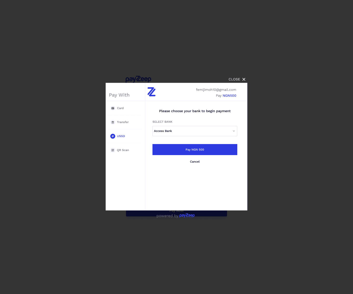
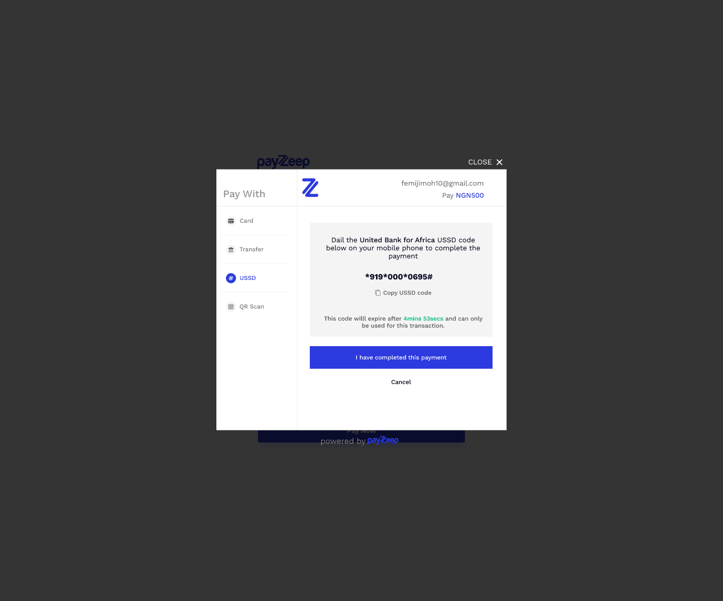
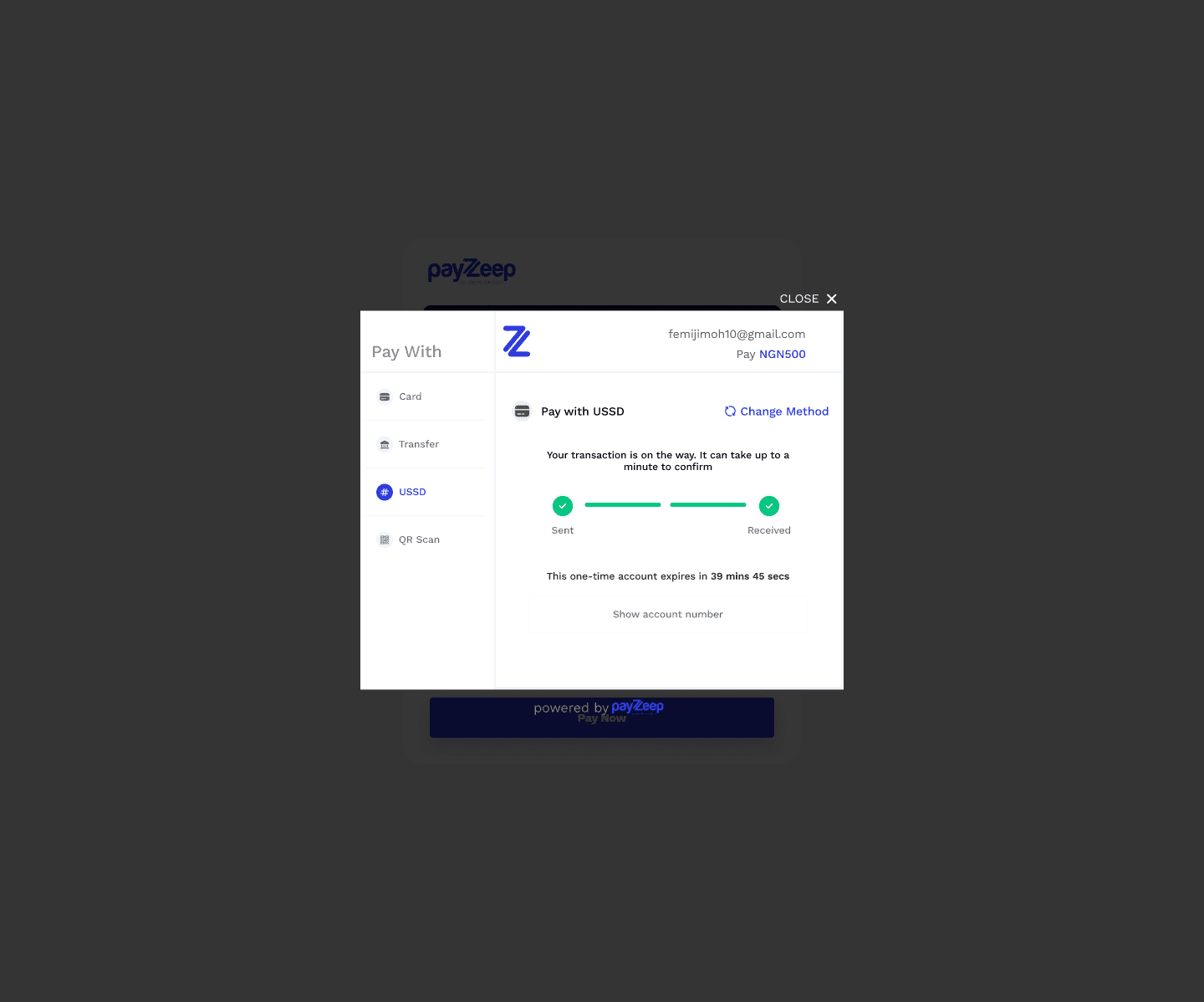
Pay with USSD
Dynamic USSD instructions based on bank selection.
Simple step-by-step format for clarity.
Focused on accessibility for non-smartphone users.
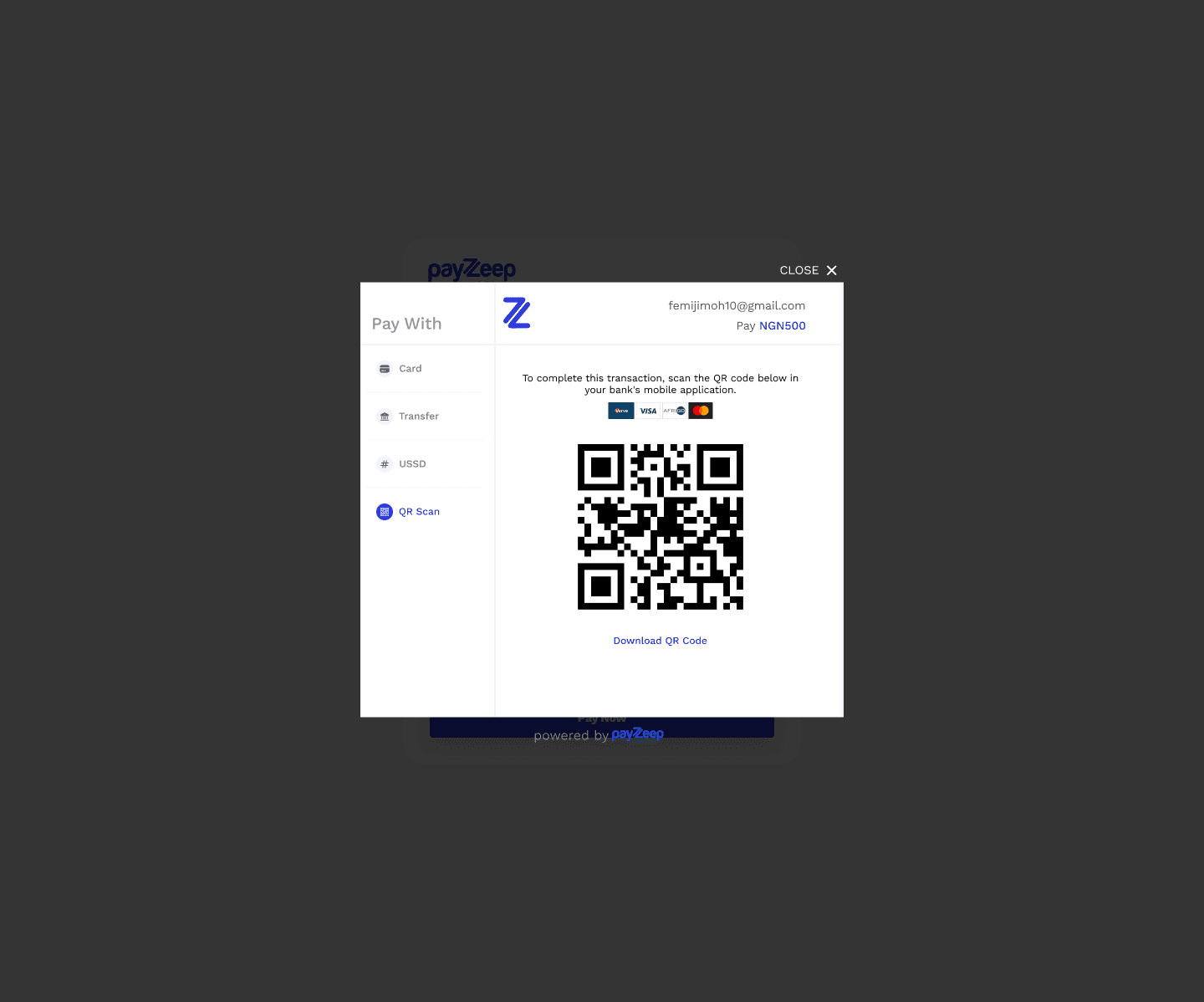
Pay with QR Code
Large, centered QR code for scanning with banking apps.
Backup text instructions in case scanning fails.
Clean white space to focus user attention.
