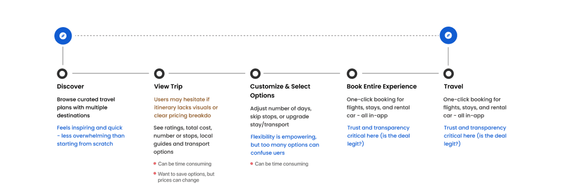
Understanding the Current Journey
After conducting interviews, I mapped out how users currently plan and book multi-stop trips without Treksphere. This helped me uncover key frustrations and opportunities to improve their experience:
Booking is time-consuming: Users often juggle multiple tabs and platforms to build a full itinerary, which takes a lot of time and effort.
Unpredictable pricing: Trip costs can fluctuate wildly depending on where and how they book, making it hard to plan or commit.
Lack of ongoing support: Many users feel stranded once the trip begins—there’s often no help available if something goes wrong mid-journey.
These insights gave me direction on what Treksphere needed to solve: simplify booking, bring transparency to pricing, and offer reliable support throughout the travel experience.


Goals
Streamline the process of booking multi-destination travel itineraries.
Create a trusted platform where travelers and locals can share and monetize curated trip plans.
Provide transparent pricing and cost breakdowns to support smarter travel decisions.
Challenges
Designing a user-friendly experience for planning complex, multi-stop trips.
Building user trust in community-contributed itineraries and information.
Ensuring support is available before, during, and after the user’s journey.
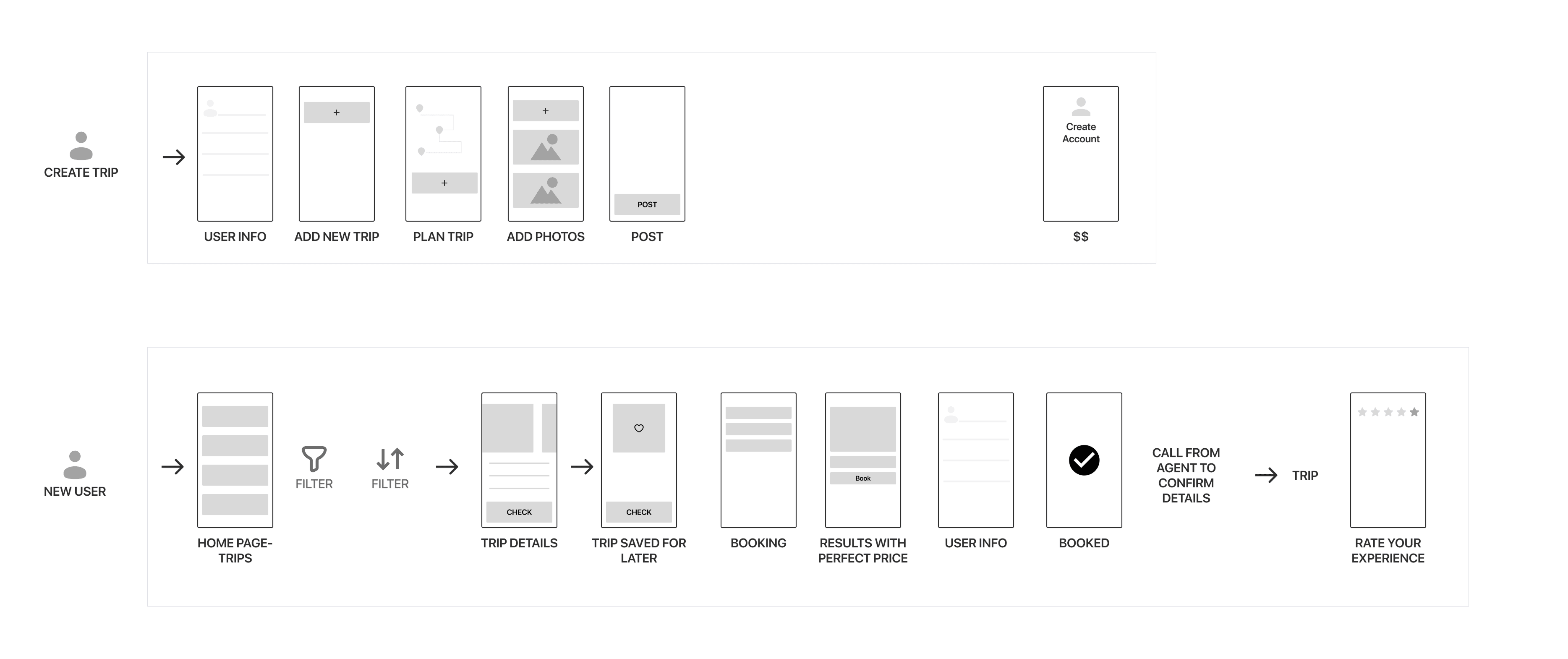


Designing, Testing & Iterating
Once I had a clear understanding of user needs and pain points, I moved on to refining the interaction flows and designing key interface elements. I shared prototypes with potential users and gathered feedback through informal testing sessions.
Based on how users interacted with the app—where they hesitated, what confused them—I made a series of small but important tweaks to improve clarity and usability.
I then launched a pilot version of Treksphere and continued to refine it using real user feedback and early usage metrics. This iterative loop helped shape a more intuitive and reliable travel planning experience.
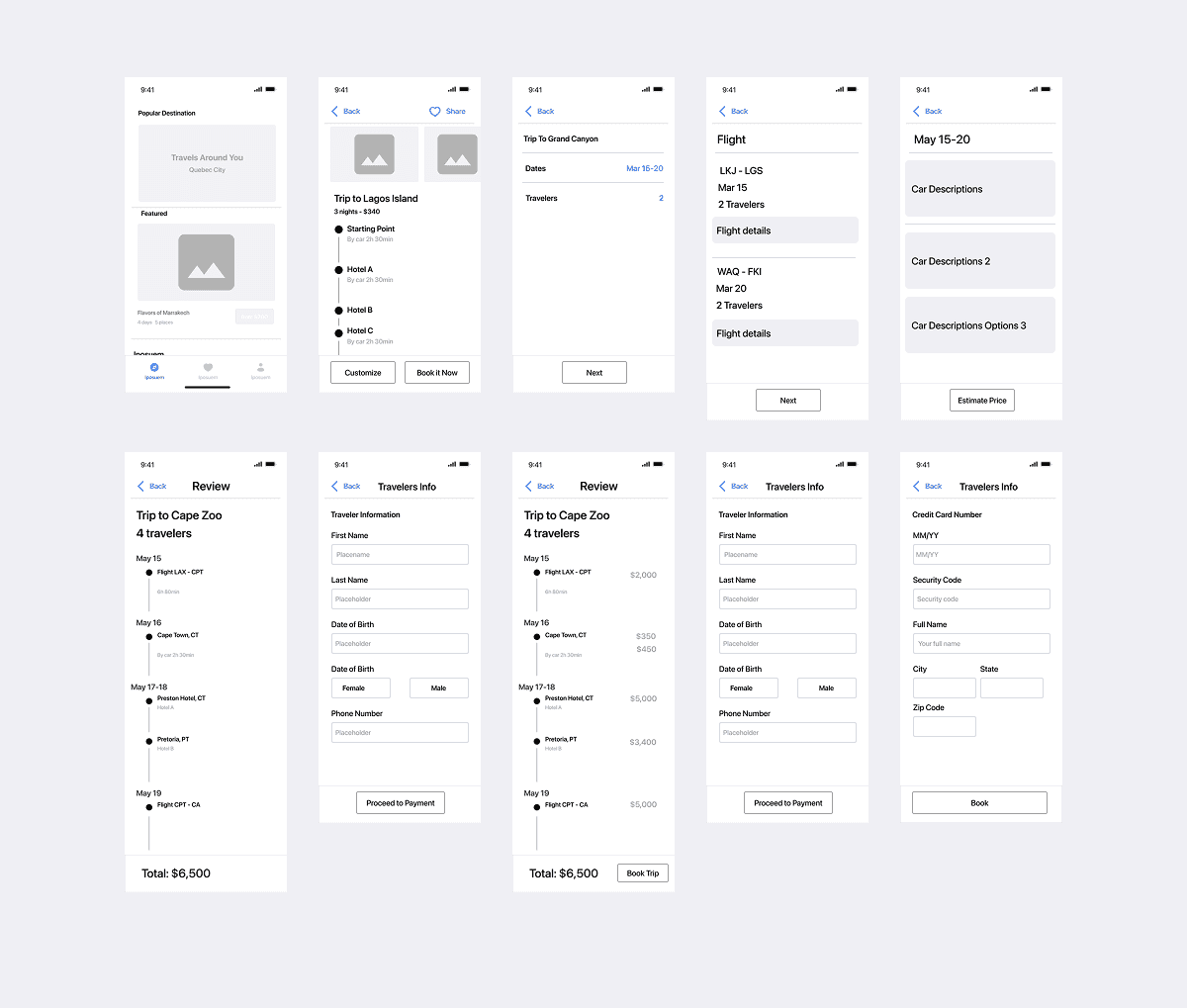
Iterations & Key Improvements
As I gathered feedback and monitored usage, I introduced several meaningful updates to enhance usability and relevance:
Reorganized trip categories on the homepage to make exploration easier and more intuitive.
Personalized recommendations based on users’ locations, helping them discover relevant experiences nearby.
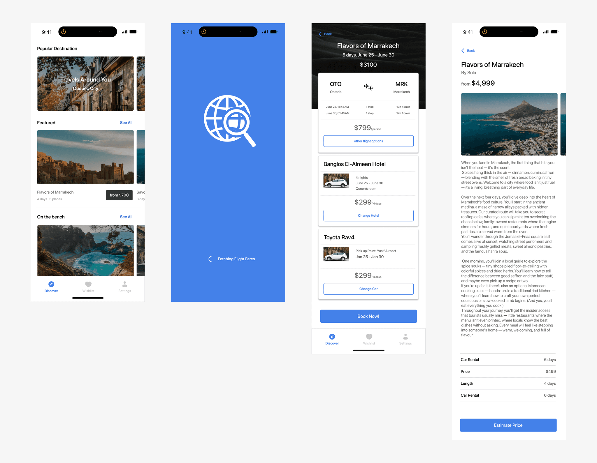
Enhanced trip detail screens with richer content—such as pricing breakdowns, locations, and day-by-day plans.
Introduced a “Customize Package” option, allowing users to exclude hotel, flight, or car rental if they didn’t need the full bundle.

Results
Reflection
Treksphere was a rewarding and complex solo project. Through it, I gained deep insight into the travel planning ecosystem and the challenges travelers face from price fluctuations to decision fatigue. I also learned the value of trust, especially when guiding users through big-ticket purchases like travel.
One thing I would do differently is to run broader usability tests earlier in the design process, particularly with more diverse user segments. While I gathered rich insights from travelers and travel agents, broader testing would have helped shape even more inclusive solutions.
Looking ahead, I see great value in releasing the product in phases rather than all at once—validating core features early and iterating quickly based on real-world feedback.